WOMADelaide
Event Branding
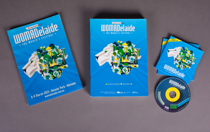
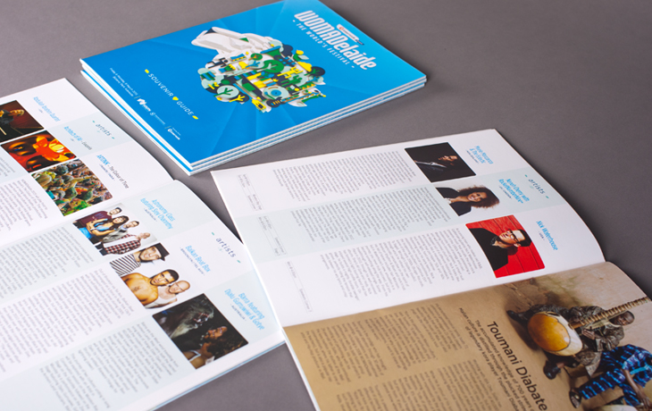
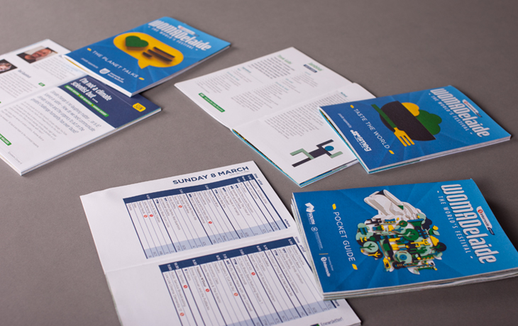
Branding, Event Identity, Event program, Sponsorship documentation, Advertising
Background
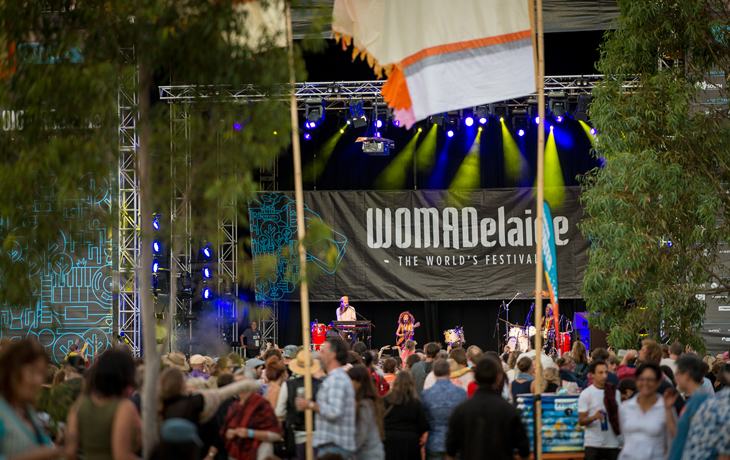
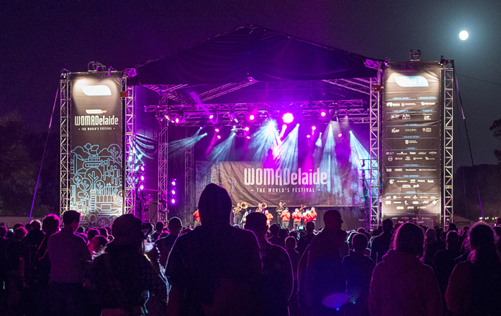
WOMADelaide is a unique 4-day annual event held in March. This acclaimed outdoor festival combines traditional and contemporary world music from extraordinarily gifted musicians, with performance and street artists, dancers and DJs in a family friendly atmosphere.
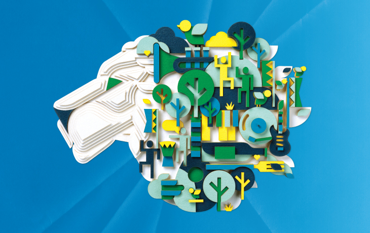
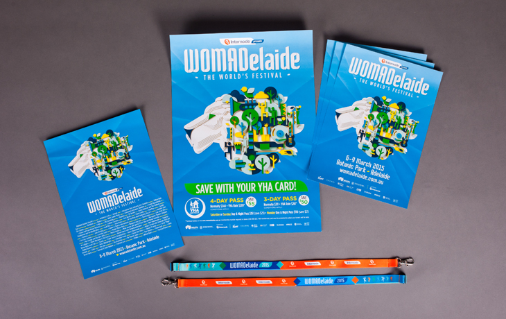
Orbit Design has been associated with WOMADelaide for the past seven years. Each year an ‘event image’ is developed to represent music, arts, dance, food and world cultures that form an integral part of this diverse, internationally-acclaimed annual event.
Approach
We work very closely with the client to establish a direction for each year’s event. One of the main criteria states that it must depict a lion — the official symbol of WOMAD. Initially, we used graphics to portray people and world cultures represented at WOMAdelaide. In later years, we changed the imagery to reflect the elements that make up the 4-day WOMADelaide event. These elements are depicted as icons and are used to create the lion head that becomes the event image. More recently, we have been experimenting with the lion to create it as more of a sculptural handmade piece.
Outcomes
Every year WOMADelaide gets bigger and better and attendances continue to grow. Our ongoing seven year relationship with Arts Projects Australia (the manager and producer of WOMADelaide), has given them the confidence to allow us to move away from WOMAD’s traditional Celtic-style lion illustration and develop a new lion brand.
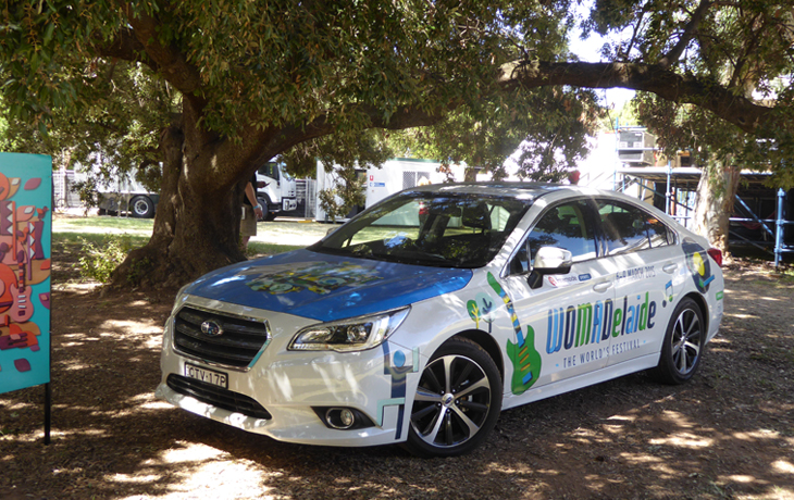
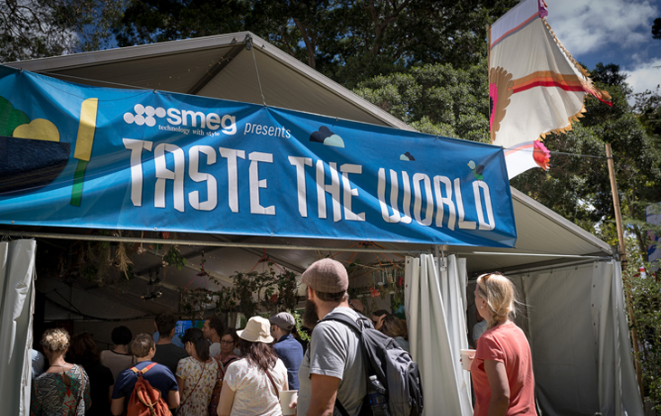
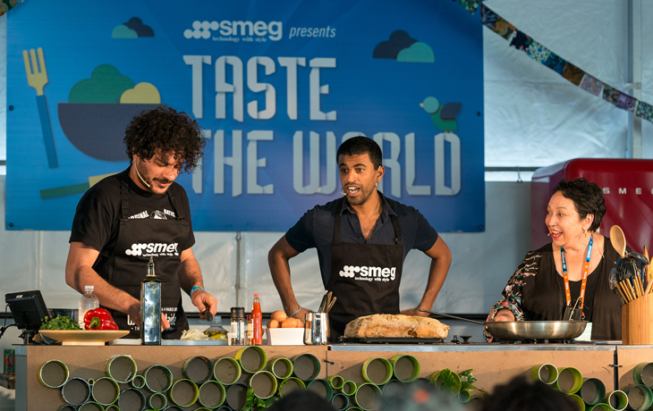
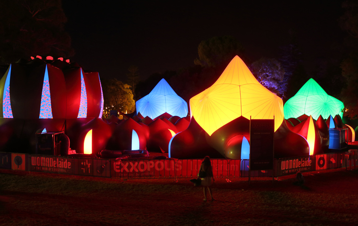
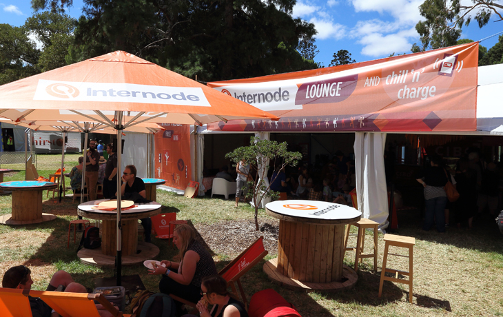
Orbit Design produces an extraordinary range of material for WOMAdelaide every year that encompasses advertising, print, digital (both website and digital advertising), ticketing, signage, outdoor, merchandise, vehicle livery and more.